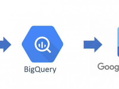
In order to produce this quick visualization of PNAD research we firstly got a CSV version of the micro data from PNAD Survey (1). PNAD has two main tables: households and individuals.
We took the individuals data and used the Dataprep tool in Google Cloud to cleaned the base and loaded the resulted new cleaned data into BigQuery. We used the dataset in BigQuery as a source to produce the Visuals in Data Studio. Finally the report is embedded in the web page with the rest of analysis.

In the first step, we selected the fields that would be used in our analysis and discarded the rest, in order to spare storage costs. We also transformed the types of some fields like ‘age’ and ‘family income per capita’, from string to integer. We also extracted the UF code from the field V0102. The table below list the fields that were used:

References: (1) We got the CSV file from Vitor George public GitHub (April, 2018)

